Lunchtime Soft Power
Julian Irlinger has a way of uncovering history in the smallest fragments of visual culture. He draws on printed matter, architecture, and, most recently, animated film as sources, creating works that explore the dialectics of form and ideology. We met in his Berlin studio on an overcast day in early summer, where he was photographing individual frames for his animated film The Curtain of Time (2025), and we talked about cartoons and the politics of mid-century modernism.
Your exhibition The Curtain of Time at Portikus earlier this year engaged with Frankfurt as a city. What drew you to connect mid-century animation with this specific urban context?
The connection came from various things I’m curious about. I’ve followed debates around Frankfurt’s architecture for years. While most large German cities were rebuilt in the spirit of postwar modernism, Frankfurt today is emblematic of a more recent, post-war, counter-movement: so-called reconstruction architecture, which uses pre-modernist forms to reinforce national identity. I’m generally interested in these intersections between ideology and aesthetics. Separately, I began working in the style of mid-century modern animation and realized that certain beliefs are embedded in this modern form as well. Its visual vocabulary—like postwar modernist architecture—has clear Bauhaus influences. This led me to connect the ideological and the aesthetic dimensions of animated film with the city itself.
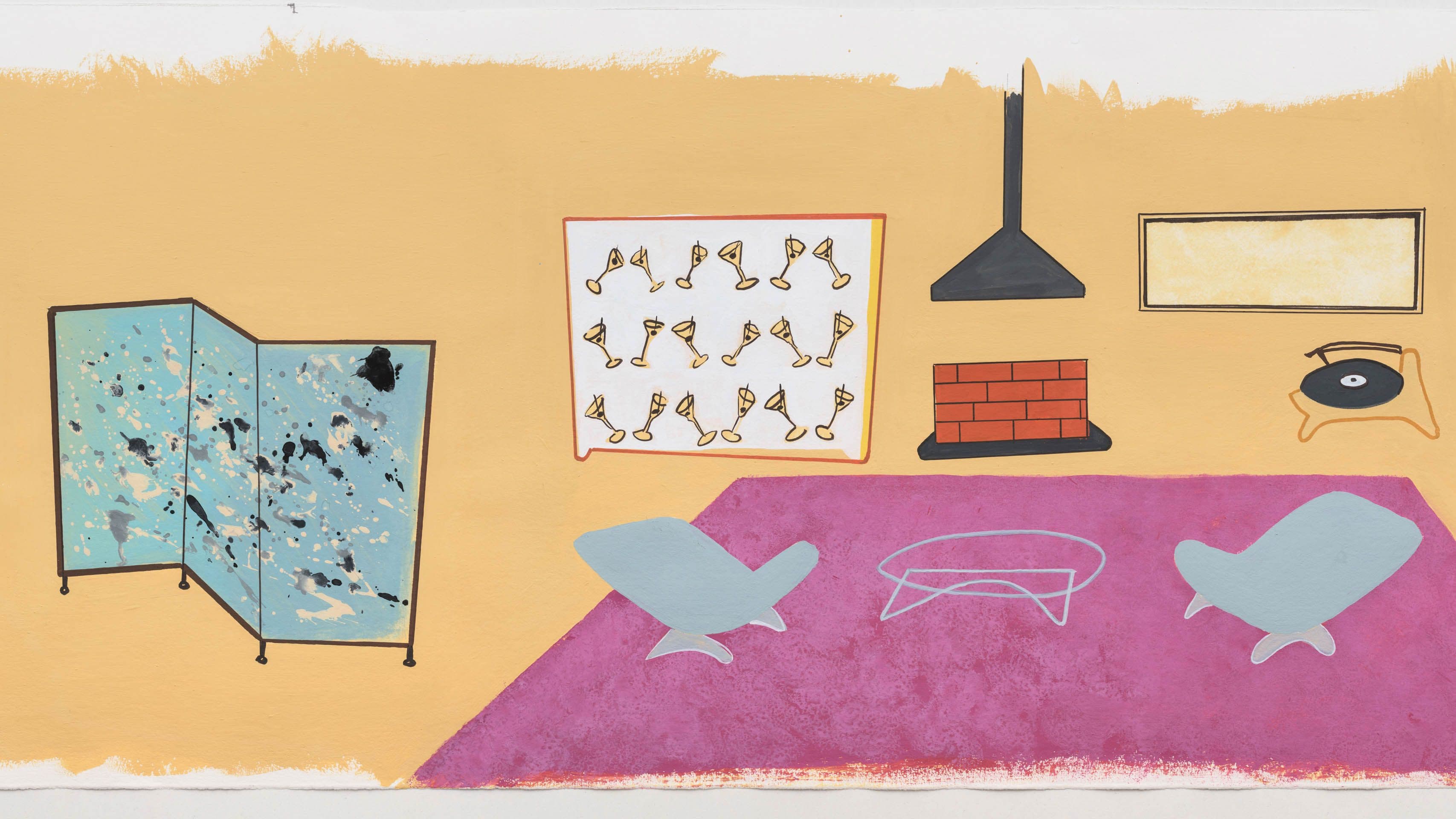
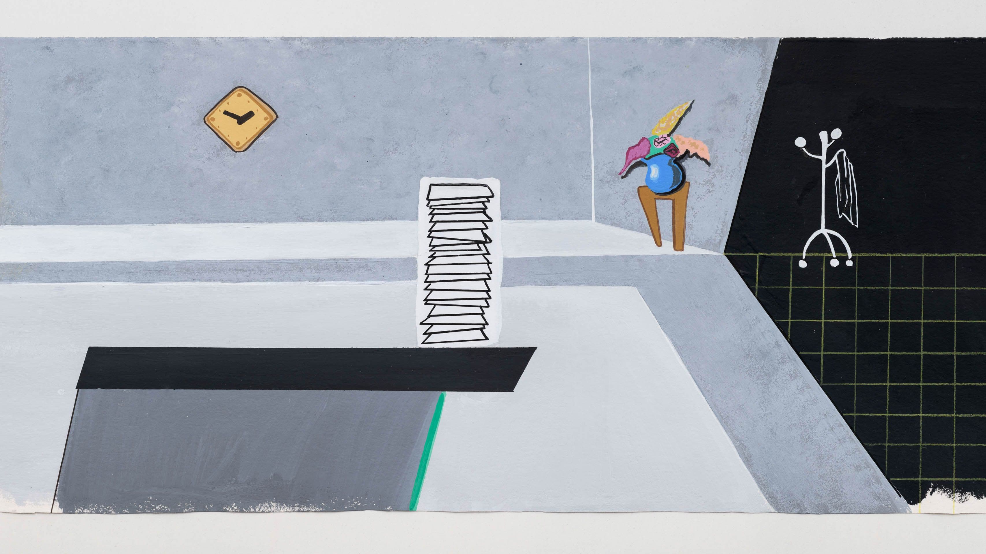
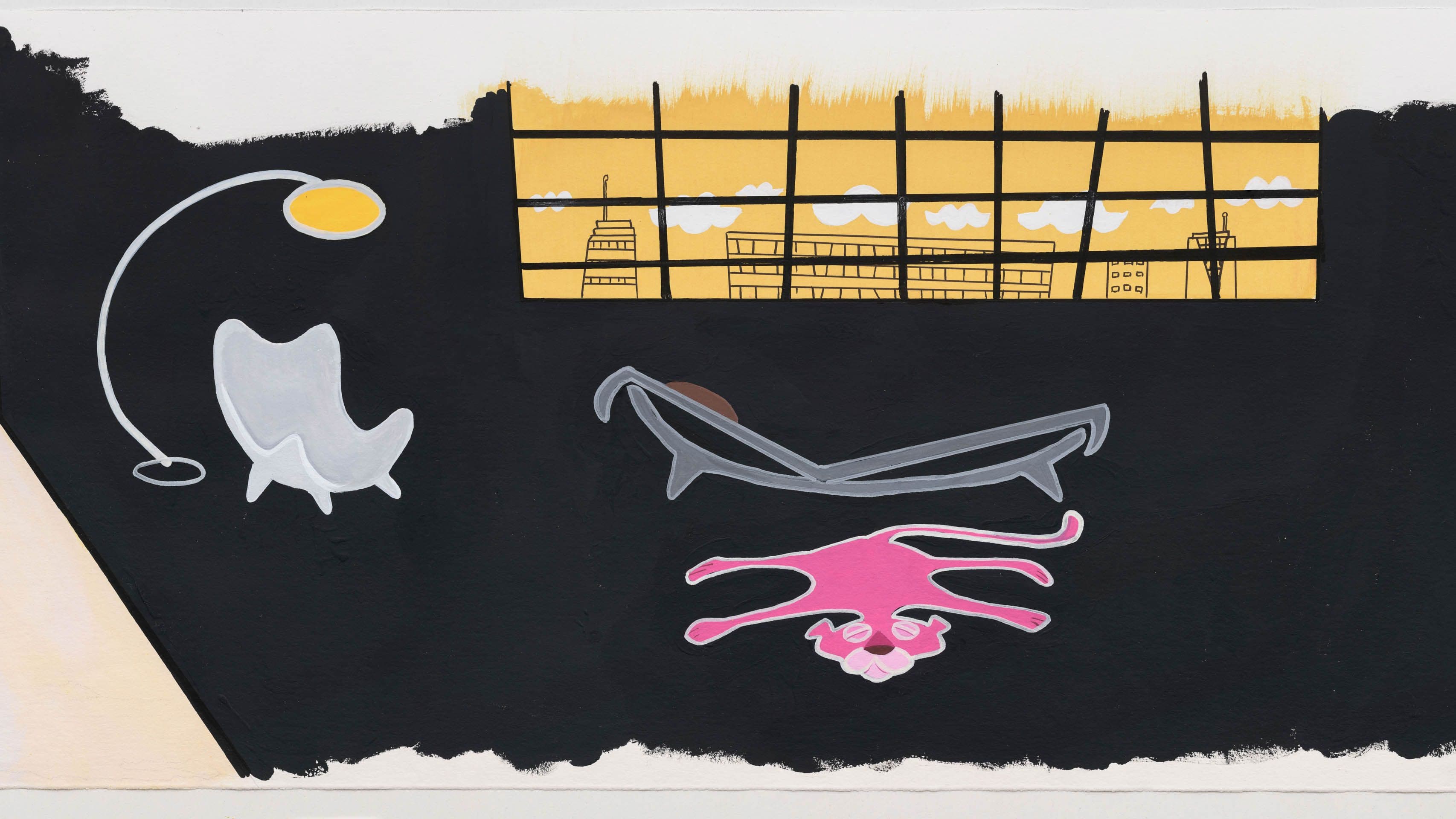
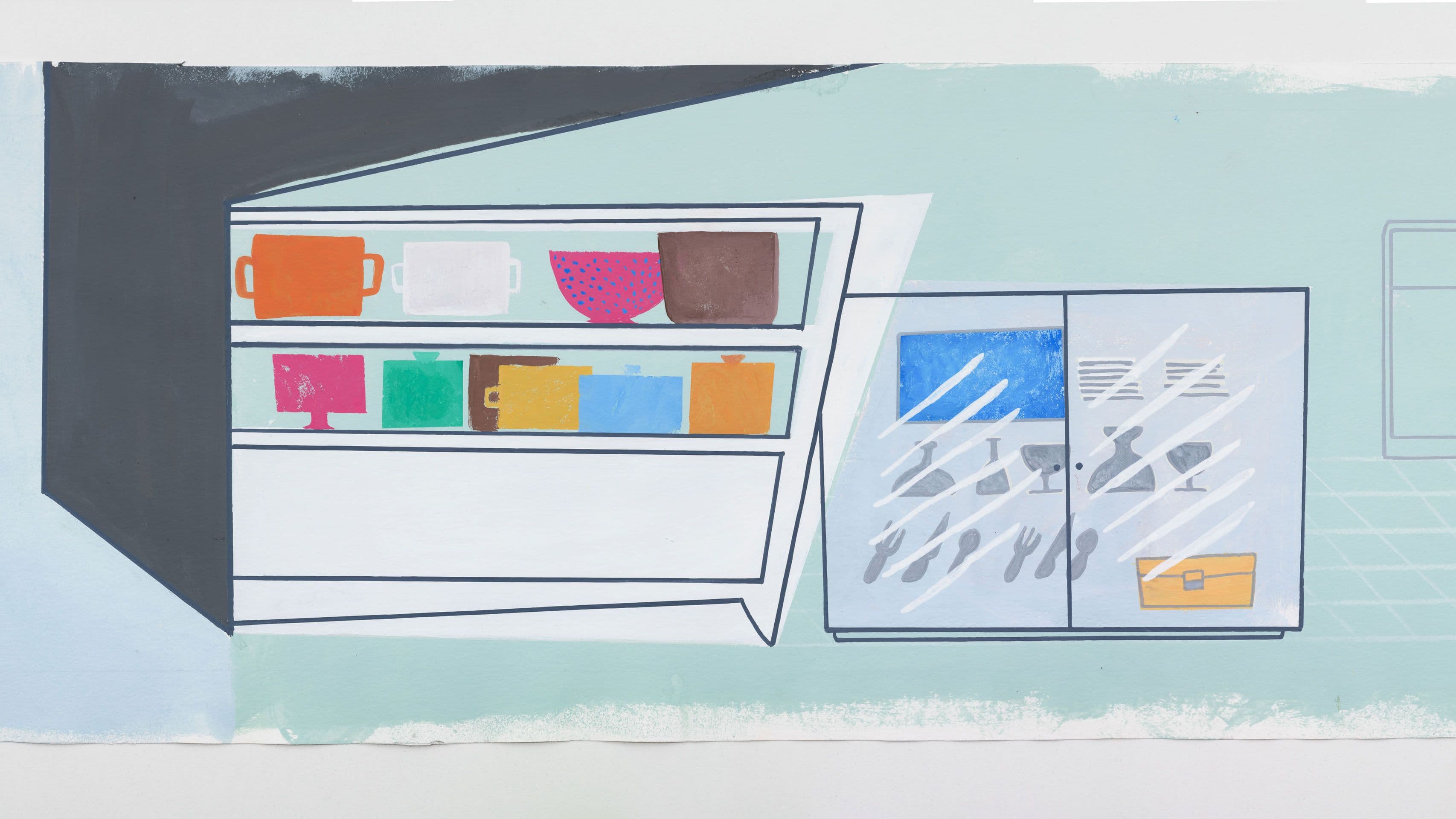
I was drawn more to working with such forms and shapes rather than to developing a storyline. In my animation The Curtain of Time (2025), we see an office of architects or urban planners designed in a mid-century modern style. Everyone inside is asleep, while construction works outside are visible through the windows. Architectural models of a modern Frankfurt skyline share space with the form of a timber-frame house. It’s recognizably Frankfurt—even the Portikus building appears—but you don’t need to know that. The focus is on the shapes themselves.
The timber-frame structures of Frankfurt’s new old town seem to contradict your interest in modernist forms.
I like these contradictions; they feel emblematic of the exhaustion of modernism. Transforming a contemporary urban space into an “old town” is absurd, because the architecture doesn’t seem to belong there. In Frankfurt’s case, the new old town is a simulation of the past, built using modern technology alongside traditional craftsmanship. Since the original plans were lost, architects designed new ones based on pre–World War II photographs. In this context, an article once asked—rhetorically and cynically—“Is timber-frame architecture fascist?” Of course not. Ideology doesn’t simply emerge from form. But such reconstructions are controversial because they present a version of the past as if the bombs of World War II had never fallen.
What initially fascinated you about mid-century animation?
It’s a style I know well. I watched animations from that period as a child. I was drawn to its visual vocabulary. The technique, called “limited animation,” is much simpler to produce than the realistic movement of Disney films. While experimenting with the form, I became interested in its history. This style was used across very different ideological systems—capitalism, communism, socialism—and was exchanged internationally with surprising results, despite the different aesthetic doctrines: socialist realism on one side, abstract expressionism on the other. Animators often studied at art schools alongside fine artists, so there was a shared knowledge foundation. And yet, unexpected visual connections emerged across these systems within the field of animation.
Can you give a concrete example of this aesthetic exchange?
Films from the United States circulated in Zagreb and the USSR. The US animator Gene Deitch even worked in Prague for US productions to create episodes for Tom and Jerry, Popeye, and others. I think the field of animation also became a loophole to explore an aesthetic project beyond the ideological constraints of the state, because of different historical circumstances. From the 1940s onward, US animators studied with Bauhaus émigrés, whose visual vocabulary had been shaped by Soviet Constructivism. Imagine such animations—rooted in Constructivism—traveling to the Soviet Union, where Constructivism had been abandoned for Socialist Realism. For Eastern Bloc artists, animation could reintroduce that lost visual language.
The exchange is visible in many films. For example, United Productions of America’s Fudget’s Budget (1954) depicts a nuclear family’s struggles in a capitalist society, using playful abstraction and object metamorphosis. Zagreb Film’s Concerto for Sub-Machine Gun (1958) offers similar visual strategies, but in the form of a heist comedy.
How did ideology manifest differently in US versus Eastern Bloc animations?
In the Eastern Bloc, ideology was more about content than form—affirming community life in a socialist sense. The state-owned East German studio DEFA produced The Sensation of the Century (1960), for example, which looks stylistically very similar to works from United Productions of America, the US animation studio, but it satirizes the space race—mocking the United States and celebrating the Soviets as the first on the moon. In the United States, ideology revolved around the nuclear family, no matter if it was set in the prehistoric past with The Flintstones or in the future with The Jetsons. A notable US example is John Sutherland’s studio, active from the mid-1940s. He produced corporate propaganda for clients like the New York Stock Exchange, the military, and the government—educational shorts designed for the “modern citizen” of the American Dream.
There’s a fascinating quote from one of those US promotional films about “good taste.”
Yes—in Sutherland’s Curtain Time (1960), a young architect is tasked with designing building components. The voice-over notes that he could realistically paint everyday products “if he were not inhibited by good taste!” Instead, he produces something resembling a Josef Albers painting. The point is clear: Good designers don’t represent things realistically—a rejection of Socialist Realism’s core principle.
Your work contains modern forms: grids and abstractions. Are these direct quotations, or your own interpretations?
They’re more like distant relatives. I’ve collected shapes from animations, and sometimes I invent them—they’re very simple to create. Some resemble pictograms. One character morphs from abstraction into a pictogram-like form, while grids suggest flatness.
You used a mid-century animation technique: hand-painted backgrounds with drawn figures moving in front.
I still work in this now-obsolete way, which has been replaced by CGI. For The Curtain of Time, I painted a twenty-meter-long background in eight sections. The moving figures were painted on transparent cels, with several needed for each movement. I photographed everything individually and composited it in Adobe After Effects. The result was transferred to 16mm film, then scanned back for digital projection, so the grain you see is real, not a filter. In a CGI-dominated world, this material process becomes a way of engaging with the past.
What role does the soundtrack play in your work?
Sound is central. In The Curtain of Time, it opens the film to an experience that goes beyond historical references and subverts the didactic tone of mid-century modern animation. The soundtrack, created by the fantastic sound artist Julián Galay, is built from field recordings of urban spaces, old buildings, analog tapes, and vinyl records. Even though it seems far removed from a conventional animation sound setup, he still approaches it with the structural logic of animation sound. A classic animation technique called “Mickey Mousing” matches sound precisely to visual movement—a piano chord when someone falls down the stairs, or when objects grow or shrink. My film uses this at times, but often sound and image drift out of sync and then come back together. Those shifts are powerful moments—when you become aware of the soundtrack’s autonomy from the image. This stands in contrast to the tightly controlled educational world of mid-century modern animation, where every movement is perfectly synchronized with sound.
Sleep and dreams appear as a theme in your piece.
In The Curtain of Time, the staff in a large office are asleep—napping at their desks or sleepwalking through the space. Animating sleep instead of more complex action is a result of my own production process. Animation is labor intensive, and I work alone, doing what studios once managed with large teams. Originally, I planned The Curtain of Time with more character action, which would have made the film shorter. But I found it more interesting to emphasize the background and its shapes, rather than what the characters could do in that setting. Putting the characters to sleep allowed me to include more of them without increasing the animation’s complexity. Of course, the question remains: Why is everyone in the office asleep? There are several possible readings. One might consider the unconscious—how history, urban planning, or form-finding processes work. These things rarely happen in public view, yet they shape how the public moves. In the film, one character and their therapist eventually wake up in a therapy session, a trope in US mid-century animation. It connects to the period’s fascination with psychoanalysis. You’d never see Cinderella in therapy.
In architecture, there was eventually the International Style—a modernism that allegedly fit globally. Is there a corresponding style in animation?
You could probably describe mid-century animation as an international style, but its initial circulation was very specific and closely tied to ideology. As I mentioned earlier, there was a shared Bauhaus-Constructivist heritage. Under Stalin, Constructivism was suppressed in favor of Socialist Realism, and animation became a way to smuggle the former’s visual vocabulary back into the Eastern Bloc. In the 1950s, United Productions of America had an exhibition at New York’s Museum of Modern Art that categorized their animations into “government,” “advertisement,” “school,” “industry,” and “entertainment.” At that time, only a small portion of animation was purely entertainment. Studios in Russia and Yugoslavia were state-owned but also embraced experimentation. Zagreb Film, for example, produced remarkable animations with soundtracks by avant-garde musicians. One notable animation is Don Kihot (1961), a whimsical cutout animation that wouldn’t have been made by a US mid-century modern studio. Still, most films produced in Zagreb share a similar visual language and aesthetic strategies with US animation, such as the use of abstraction, limited animation techniques, and mid-century modern design elements.
Your work seems deeply concerned with questions of nostalgia and historical reconstruction.
I’m always interested in how we relate to the past—through rituals, institutions, archives. Nostalgia often has a negative connotation, but I try to approach it without judgment; it’s a common way of connecting with the past. I’ve explored architectural reconstruction before. In an exhibition in Berlin, I focused on the rebuilt gallery building, which had once been a Jewish-owned fashion store. The owners’ restituted descendants, now living in New York, collaborated with a conservative architectural firm from Berlin to reconstruct the design of their ancestor. The original intended target of Allied bombs was not the former owner, and the clients had never lived in Germany. This complicates the narrative that historical reconstruction is solely tied to nationalist identity.
How do you approach these contradictions in your own work?
I’m drawn to forms that carry ideological weight and are meant to educate or shape us. Contradictions are productive—they make you question such forms and beliefs. I try to explore them without moral judgment, leaving the audience to draw their own conclusions.
Julian Irlinger (Erlangen, Germany, 1986) is an artist based in Berlin. Recent solo exhibitions include Portikus, Frankfurt/Main (2025), Kunstverein für Mecklenburg und Vorpommern in Schwerin (2025), Wende Museum, Los Angeles (2022), Galerie Wedding, Berlin (2020), Wilhelm-Hack-Museum, Ludwigshafen (2019), and Kunsthalle Darmstadt (2017). His work has also been featured in exhibitions at Hamburger Kunstverein (2023), Dortmunder Kunstverein (2022), Kunsthalle Baden-Baden (2018), Artists Space, New York (2018), and Kunsthalle Wien (2016). Irlinger graduated from the Städelschule in Frankfurt am Main in 2017, and was a participant of the Whitney Museum Independent Study Program 2017/18 in New York.
Philipp Hindahl is a magazine writer and editor based in Berlin. He covers art, architecture and cities, society and literature.
All images: Julian Irlinger, The Curtain of Time (Production Still), Gouache on Paper, 2025
finanziato dall'Unione Europea - Next Generation EU